UX-UI
Client
University project
Role
UX/UI designer
Problem
The main problem Catch-Ching aims to tackle is the lack of financial education among beginners. Users often find personal finance content overwhelming, abstract, or poorly structured, while existing tools fail to provide clear guidance or engaging experiences. The challenge was to create an intuitive, visually appealing app that teaches financial concepts step by step, motivating users and helping them gain confidence in managing their finances.
Process
We explored the needs, pain points, and motivations of beginner students in personal finance through documentary research, surveys, and user interviews, gaining deep insights into the challenges of financial education.
We summarized the research findings to define the main problem and establish clear learning objectives, identifying opportunities to make financial education engaging and accessible.
We generated concepts for learning flows, gamified interactions, and interface layouts, focusing on clear navigation, bite-sized lessons, and motivating user experiences.
We started with low-fidelity paper prototypes to quickly visualize ideas and flows. These were progressively refined into interactive digital prototypes.
Through multiple rounds of user testing, we iterated on the prototypes, refining UI, interactions, and content presentation until reaching a polished high-fidelity prototype that maximized usability and engagement.
The final designs were delivered as high-fidelity screens and a complete design system, ready for development, ensuring a consistent, engaging experience across all app features.
Solution
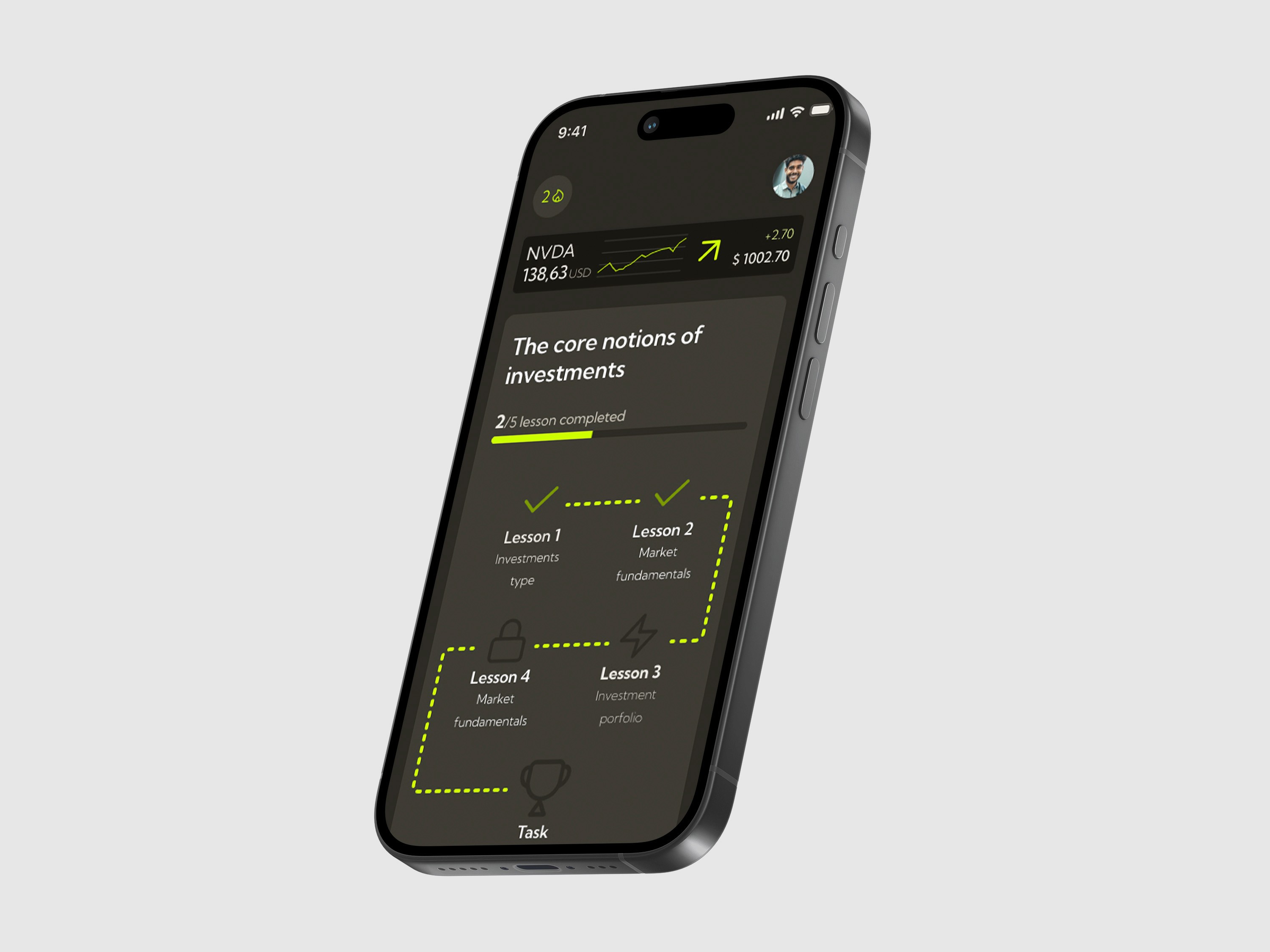
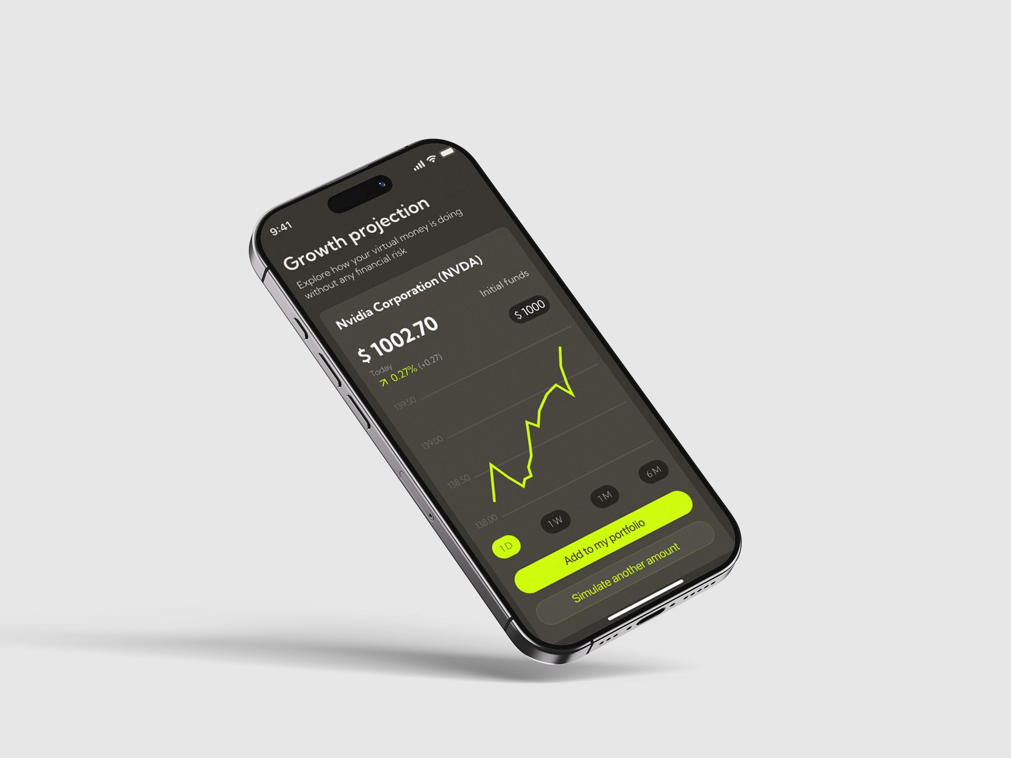
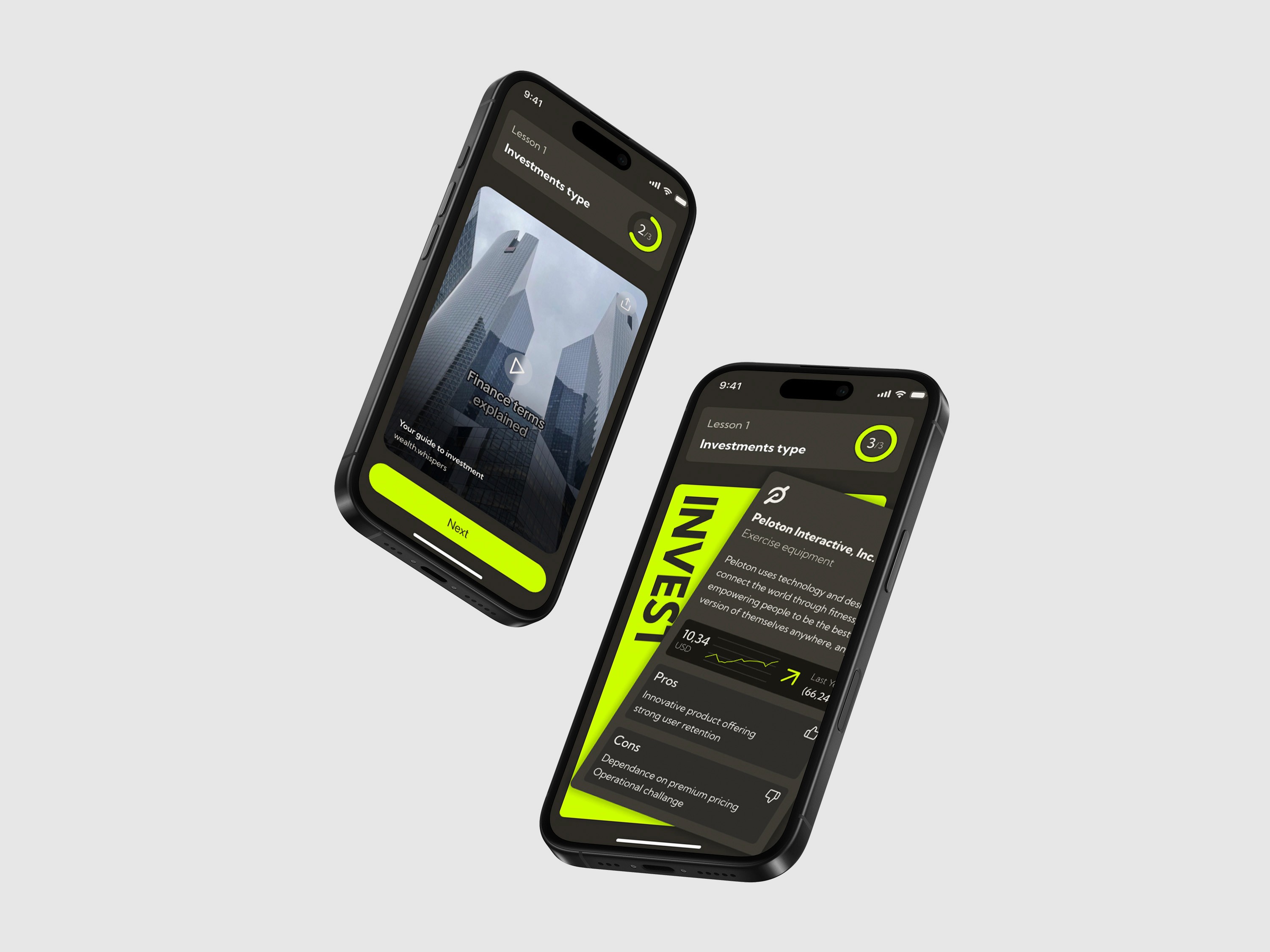
These mockups showcase Catch-Ching’s interface, designed to make financial learning clear, engaging, and interactive. Each screen was carefully crafted to guide beginner users through bite-sized lessons, gamified interactions, and progress tracking, reflecting the app’s modular visual system and cohesive learning experience.

Reflections
I learned how to interpret surveys, interviews, and desk research in a structured way, transforming raw insights into concrete design choices for flows and features.
Starting from paper sketches helped me understand the value of quick, low-fidelity experimentation before committing to detailed UI work.
Designing multiple lesson types taught me how essential it is to establish clear rules for components, patterns, and layouts to keep the app coherent.
Working with financial concepts pushed me to find visual solutions that simplify abstract information without losing clarity or accuracy.
As a team project, I learned how to align design decisions, share responsibilities, and integrate feedback efficiently, improving both the process and the final product.
" height="27.83055057067871px" id="L6OCuAXw_" transform="translate(0.488 0.023)" width="27.48780693161011px"/></svg>)
Contact
I welcome the opportunity to connect with you and discuss how my background aligns with your needs. Please feel free to contact me through the contact you can get by pressing below:
©danielelepore