GRAPHIC DESIGN
//
UX-UI
Client
University project
Role
Graphic & UX/UI Designer
Problem
The project emerged from the need to oppose the harmful impact of fast fashion, from pollution to child labor in production chains. Existing resources were fragmented, overwhelming, and visually inconsistent, making it hard for users to understand the real consequences and adopt better habits. The goal was to create a coherent visual identity and a clear interface. The system had to present complex information in an accessible way and maintain a unified experience across features and platforms.
Process
I explored the social and environmental impact of fast fashion, including sustainability issues and child labor, while studying competitors to identify trends, gaps, and opportunities for innovation.
I outlined the structure, hierarchy, and key touchpoints for the main product, namely the magazine, along with the supporting newspaper, book series, and app, ensuring a unified and consistent experience across all platforms.
I created a bold, activism-inspired visual identity, designing every product down to the smallest detail, including the entire magazine layout with pagination, the newspaper, the book series, and the app, and developing a design system to maintain consistency in layouts, typography, and graphic elements.
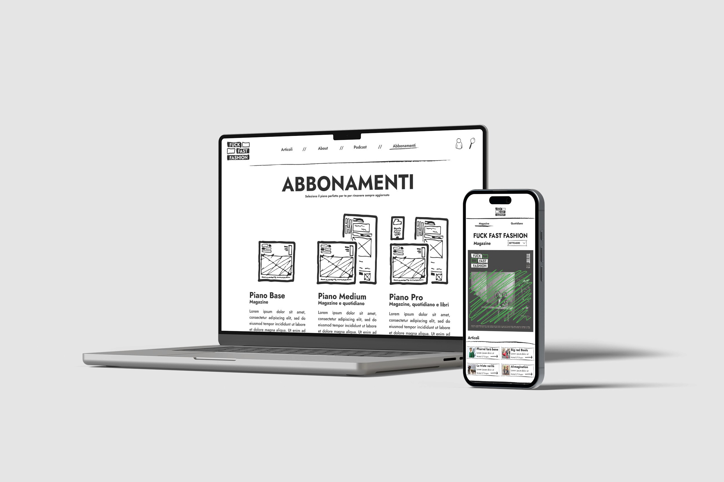
I created the complete visual system and high-fidelity user interface for the app, printed a sample for each product, and prepared a presentation to explain my work, ensuring that all touchpoints (magazine, newspaper, book series, and app) were visually aligned, functional, and appealing.
Solution
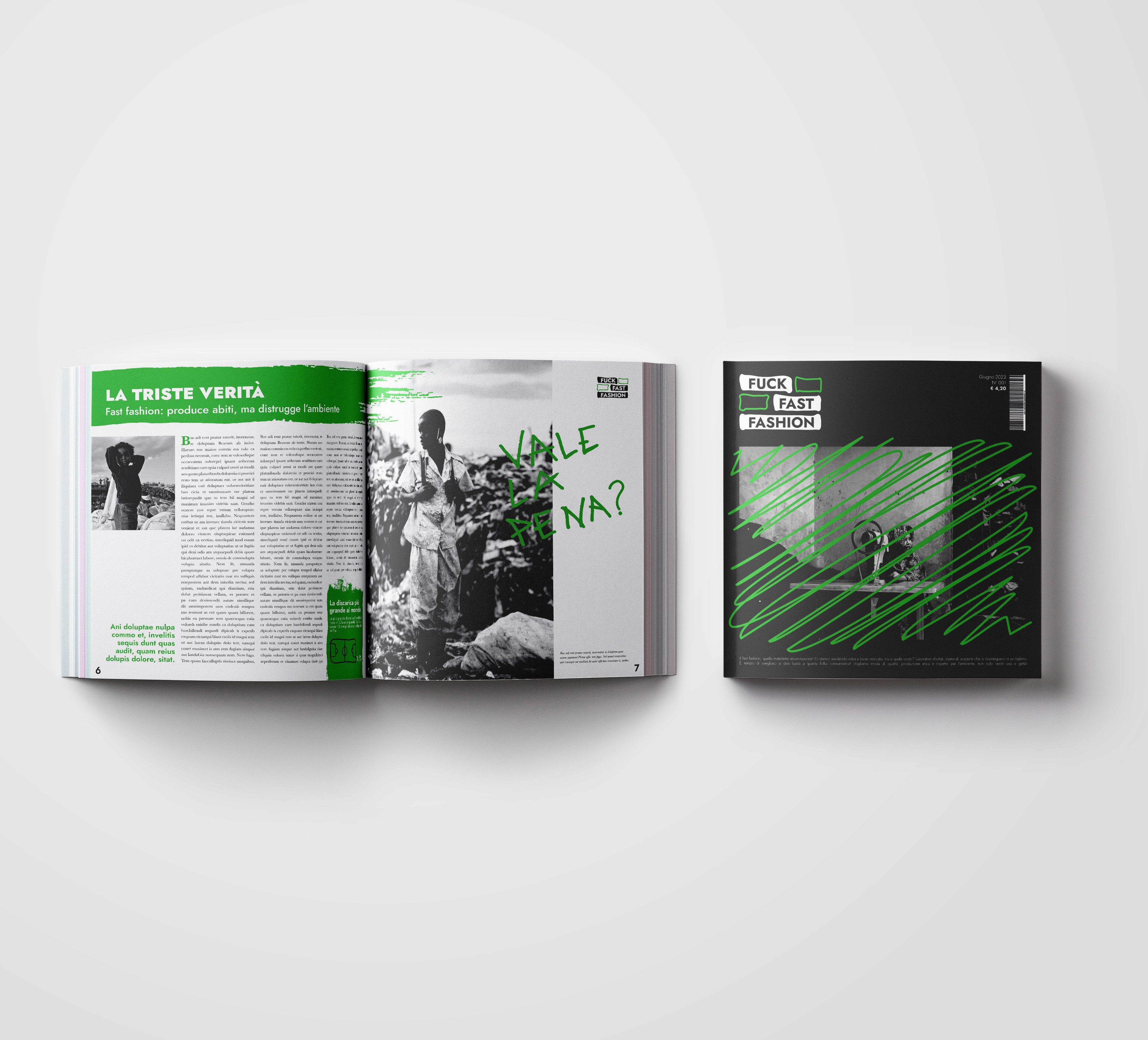
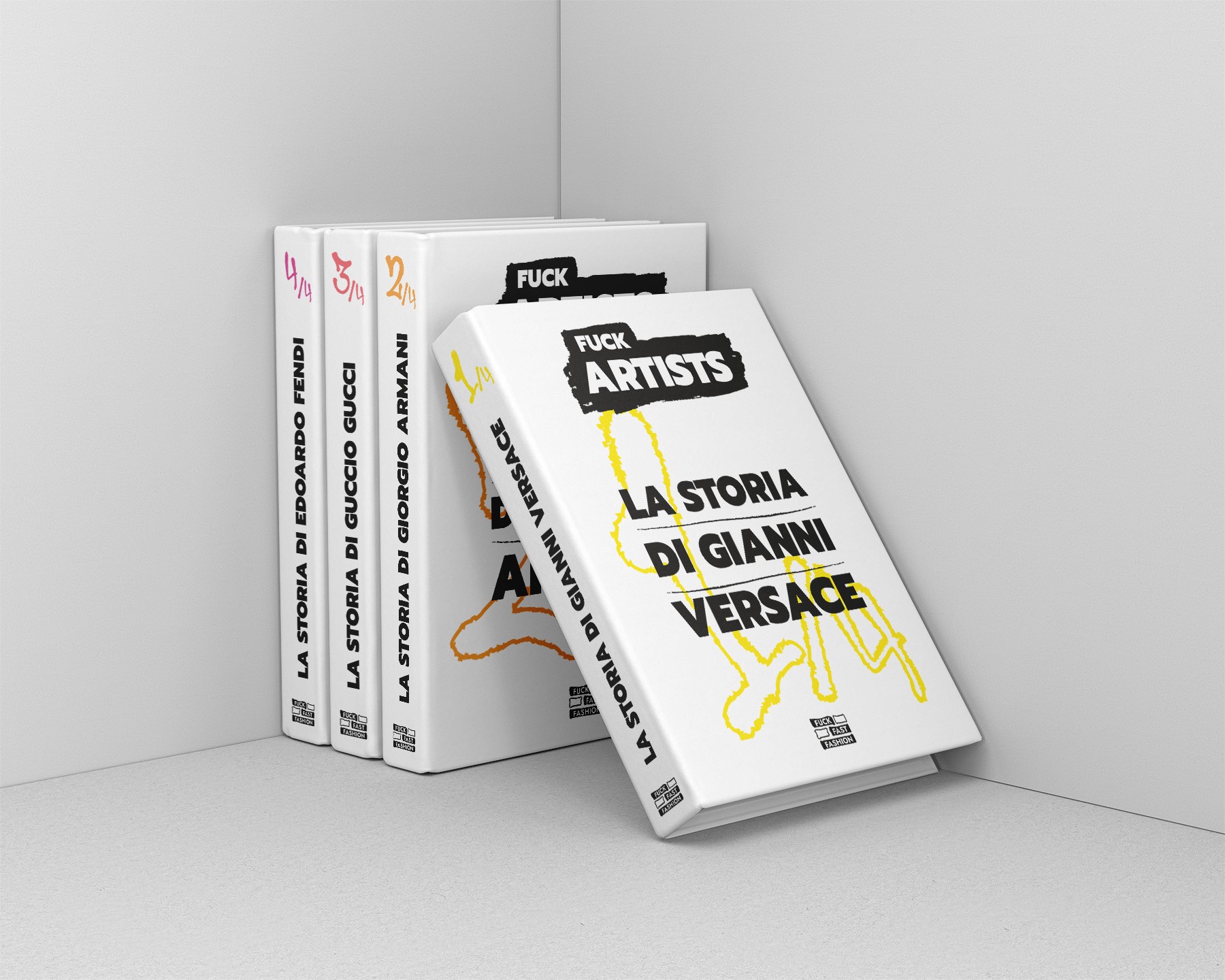
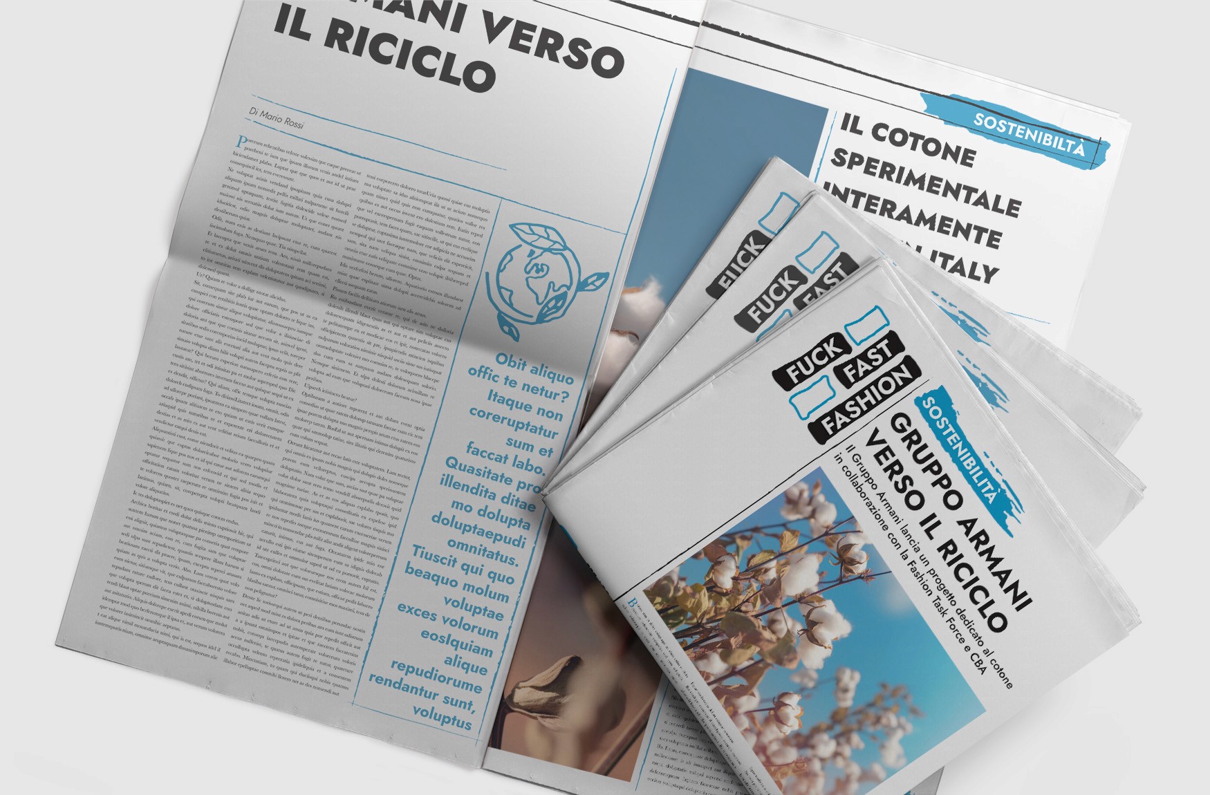
These mockups showcase the visual identity and interfaces of FuckFastFashion, spanning the magazine, journal, book series, and app. Every product was designed to maintain a cohesive, activist-inspired style while ensuring clarity, readability, and engaging layouts, translating the mission of the project across print and digital platforms.

Reflections
I learned how to maintain visual and functional consistency across print and digital products, ensuring a cohesive identity for the magazine, journal, book series, and app.
I learned how to make an activist-inspired visual language both striking and readable, balancing creativity with clarity across print and digital products.
I gained experience thinking beyond a single product, considering how each element communicates the mission of the project and interacts with the other touchpoints in the system.
" height="27.83055057067871px" id="L6OCuAXw_" transform="translate(0.488 0.023)" width="27.48780693161011px"/></svg>)
Contact
I welcome the opportunity to connect with you and discuss how my background aligns with your needs. Please feel free to contact me through the contact you can get by pressing below:
©danielelepore