GRAPHIC DESIGN
//
UX-UI

Client
University project
Role
Graphic & UX/UI Designer
Problem
Most social platforms prioritize visual aspects, making it difficult for users to find meaningful discussions and knowledge-based communities. The challenge was to design a clear visual identity and interface that encouraged reading, writing, and active participation, while maintaining simple, content-focused navigation.
Process
Explored social platforms and text-based communities to understand trends, user expectations, and opportunities for a content-driven environment.
Identified the core pillars of the platform: writing over imagery, thematic communities, and collective knowledge building. This led us to define a visual direction inspired by the newspaper world, editorial, and intentionally text-first.
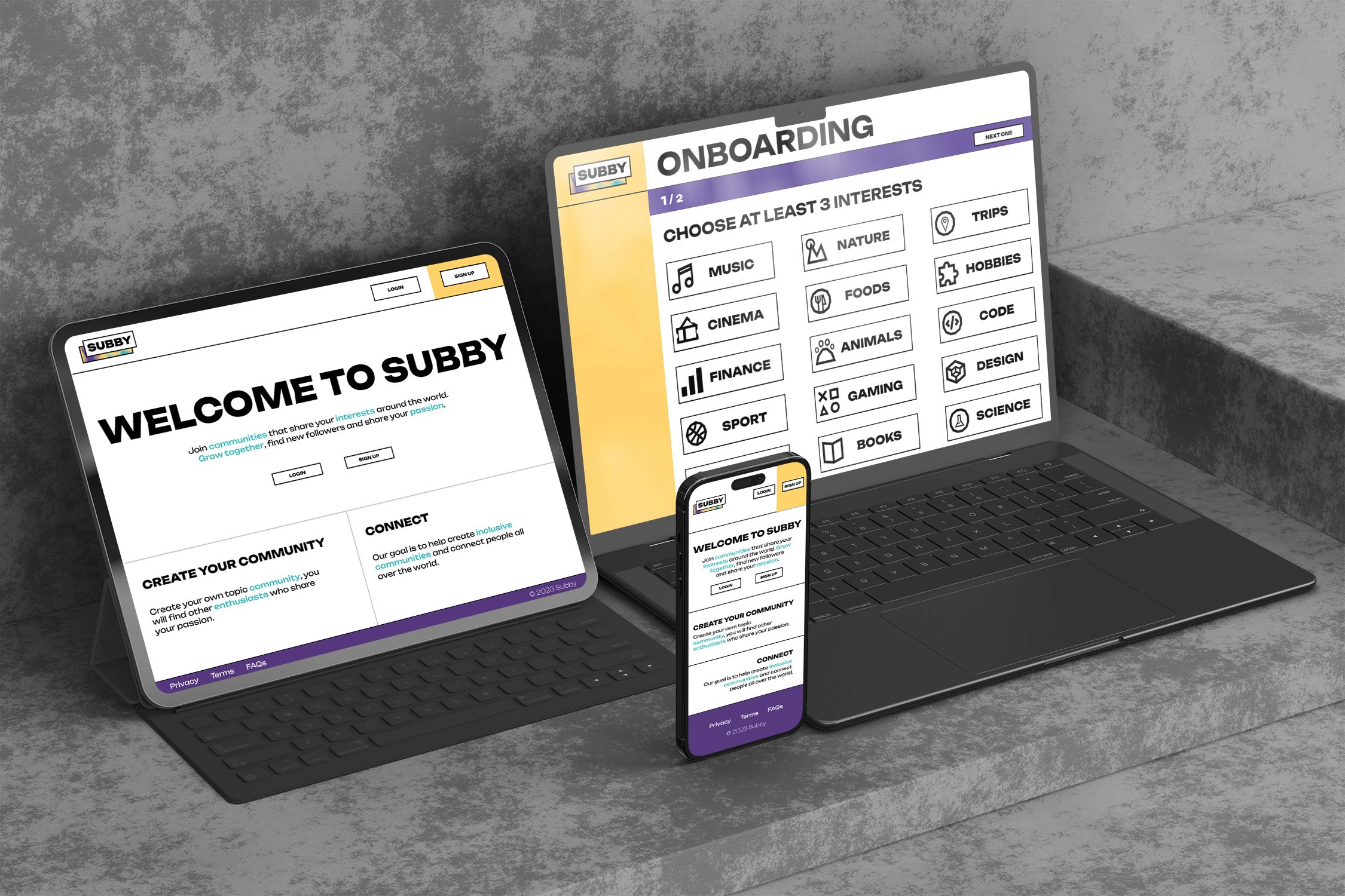
Developed a cohesive visual system, including logo, color palette, typography, and graphic style-designed to support clarity, inclusivity, and a strong sense of community.
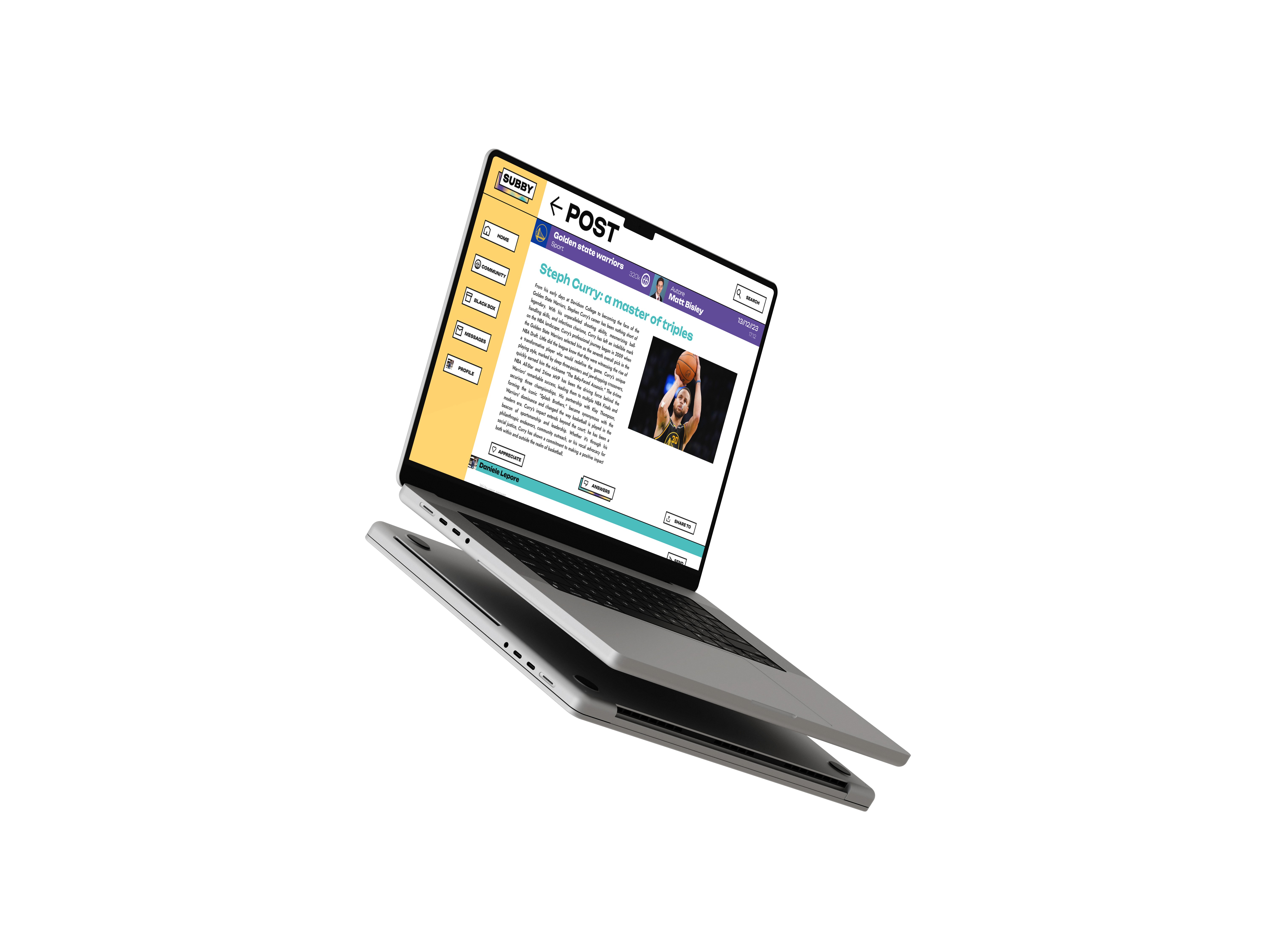
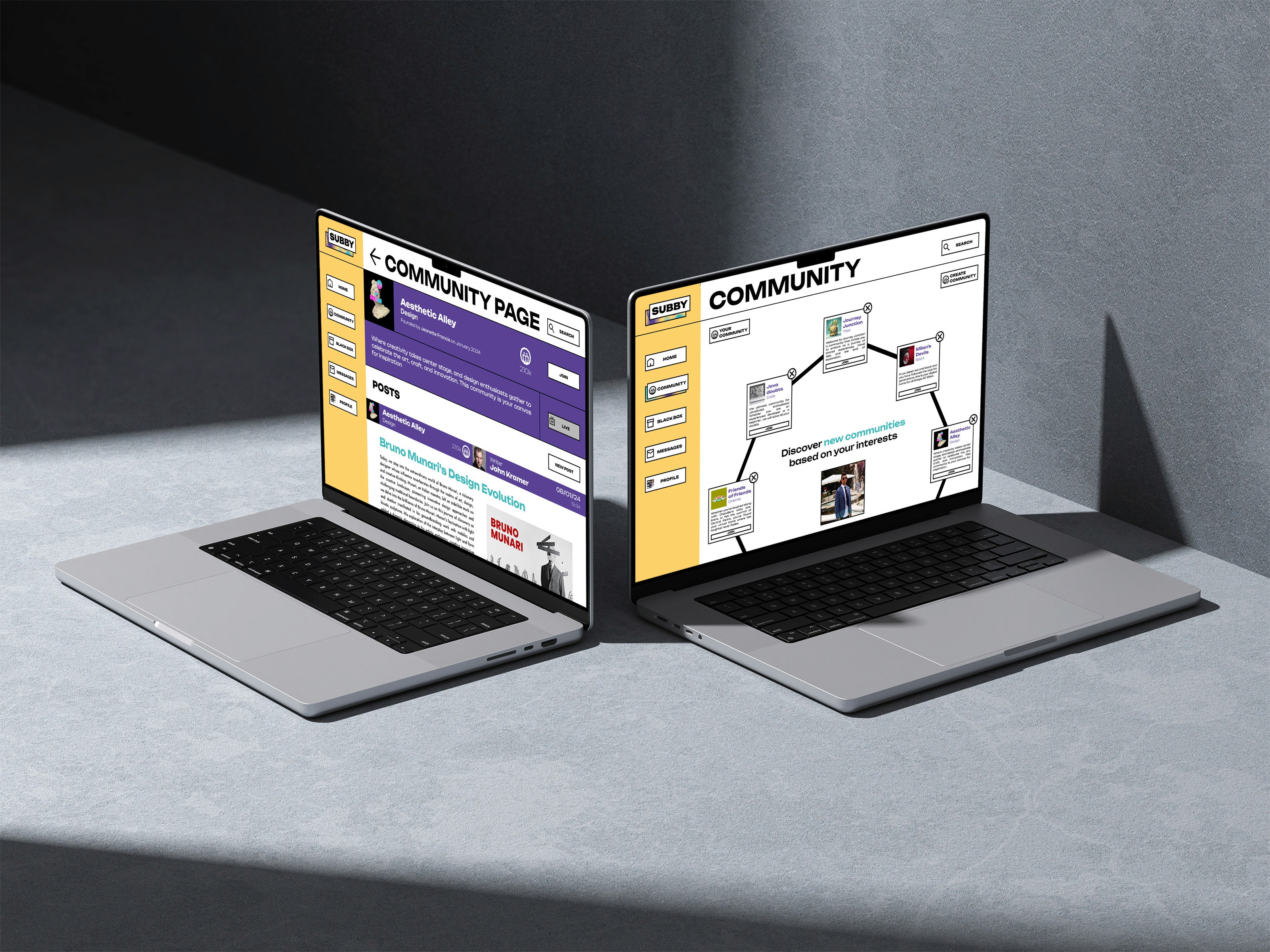
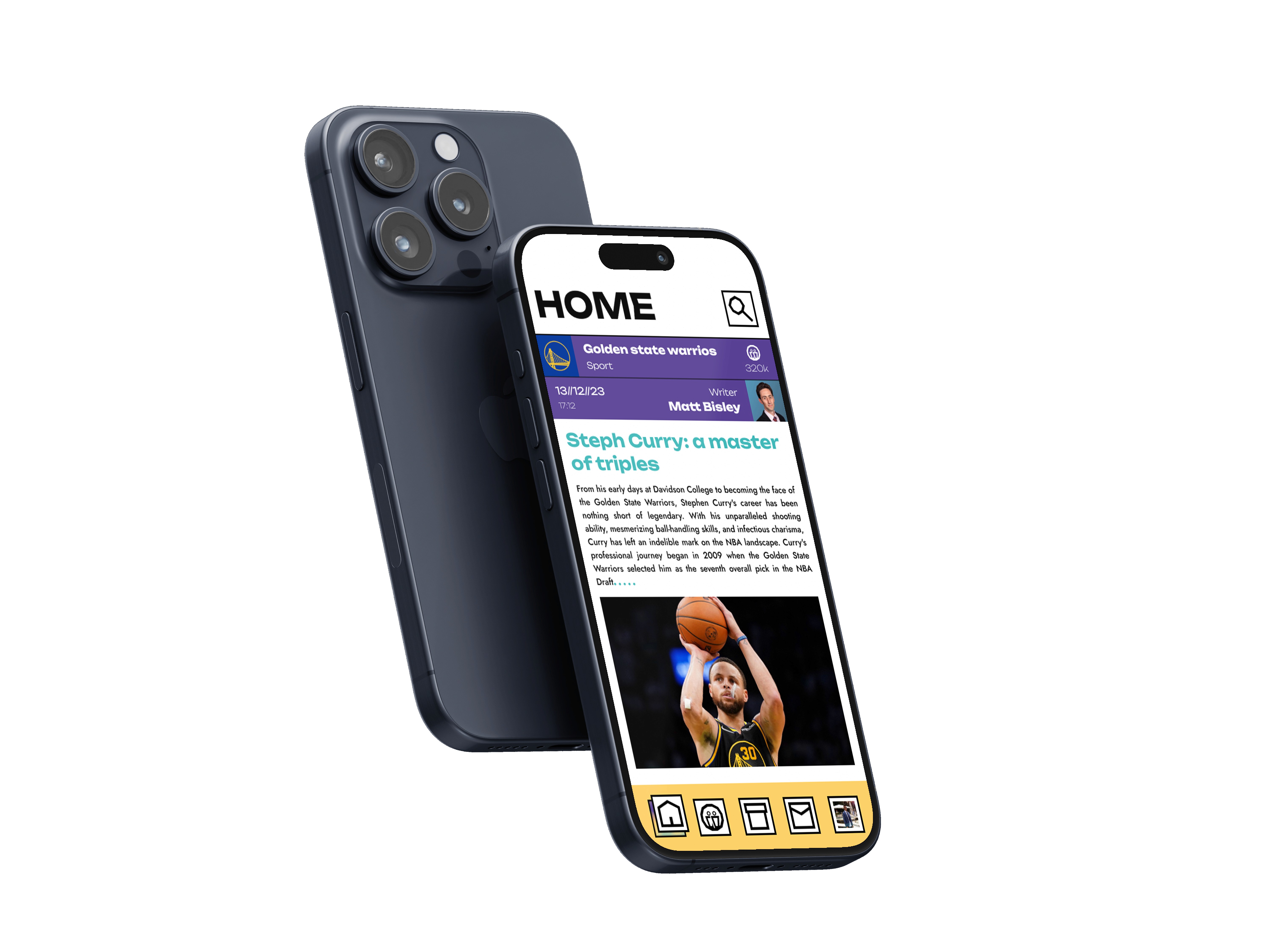
Created the interface structure with a focus on readability, hierarchy, and intuitive navigation. Designed layouts to keep written content central and to facilitate seamless transitions between communities.
Produced high-fidelity screens and a complete visual system ready for development, ensuring consistency across every touchpoint of the platform. Alongside the final design assets, I prepared a full presentation explaining the concept, process, and rationale, as well as all supporting documentation needed for a smooth handoff and future design scalability.
Solution
These mockups showcase Subby’s newspaper-inspired visual identity and interface, designed to prioritize written content and support active participation. Every screen emphasizes readability, clear hierarchy, and cohesive navigation, reflecting a system built for discussion and knowledge sharing.

Reflections
I learned how to prioritize text as the main element of a digital product, refining typography, spacing, and hierarchy to support long-form reading and contribution.
I learned how to create a distinctive visual identity that stays neutral enough to let user-generated content take the spotlight.
Working on Subby helped me understand the complexities of organising thematic spaces, designing flows that allow users to explore multiple communities without losing orientation.
Without extensive user testing, internal iteration became essential. I learned to critically evaluate visual decisions and systematically refine them to achieve a clean and consistent end result.
" height="27.83055057067871px" id="L6OCuAXw_" transform="translate(0.488 0.023)" width="27.48780693161011px"/></svg>)
Contact
I welcome the opportunity to connect with you and discuss how my background aligns with your needs. Please feel free to contact me through the contact you can get by pressing below:
©danielelepore